Location from Mattie Goddard
This post was written by Mattie Goddard.
Friday, 21 April 2017
Costumes
In terms of planning costumes, we wanted completely opposing looks for the two characters. At the beginning of the film, in the bathroom/'funeral' scene we want the character Angelo to be dressed smartly, as if dressed for a funeral, here is a sketch of the potential and ideal costume:
We managed to source the clothes to create this costume; a white shirt, a red tie, black trousers, a black pinstriped jacket with a black fedora hat.
We managed to source the clothes to create this costume; a white shirt, a red tie, black trousers, a black pinstriped jacket with a black fedora hat.
 |
| This is what Arthur's character, Angelo will be wearing as well as the jacket and fedora hat. We have chosen this costume idea as it links with the narrative of the film. We have the idea of the bathroom scene being Angelo's own personal funeral for his victim. The darkness of the suit he is wearing correlates the darkness of his character and his past and future actions. The white colour of the shirt under the jacket is symbolic of his underlying purity that gets consumed by the darkness of his suit and the metaphorical darkness. Furthermore, the red tie is symbolic of the danger he is about to be engrossed into, almost as if it is a indistinct symbol.  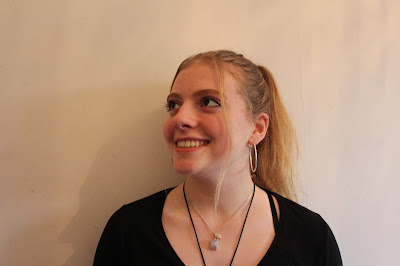 For the character Annie Floyd is playing, we decided to let her chose her own costume and wear her own clothes. This is because she is playing a more vulnerable 'normal' character that the audience are hopefully going to relate to as she is a realistic character. This is why we made the decision for her to choose her own costume, as it would appear more naturalistic as she is essentially playing a character not majorly different to herself. This post has been written by Mattie Goddard. |
Friday, 31 March 2017
Tuesday, 28 March 2017
UPDATED Q5
How did you attract/ address your audience?
We decided on choosing the particular target audience of males and females aged between 14 and 20 years old. However, I feel our film would be aged 18+ if the actors playing the characters were professional actors of an older age, but because the actors in our film are aged 17, it is less likely to appeal to anyone older than 20 years old. This is because it would not be taken
seriously enough by people older than the actors as they would be viewed as too immature to take on the serious roles that are involved in our film.
seriously enough by people older than the actors as they would be viewed as too immature to take on the serious roles that are involved in our film.
 The narrative techniques that we have included involve the main character having a psychologically disturbing persona, this is shown from the opening scene to which the character played by Arthur walks into his bathroom where a dead girl is lying in the bath. Which he then proceeds to stroke her hair and place a ring on her finger. These subtle but effective actions that the character carries out help build the character profile of him being an enigma which helps engage the audience from the start. We also use a non-linear narrative to hook the audience in the attempt for them to want to know more, to intrigue them from the beginning. A limited use of di
alogue is shown
in the opening 2 minutes because we decided to use the camerawork, mise-en-scene and editing as a hook sintead of hooking the audience from the use of dialogue. I also think that having a limited range of dialogue doesn't give away too much to the audience about the plot, which is another technique in engaging the audience and hoping for them to question the plot and having the need to know more.
 The opening to our thriller entices the audience by involving a major cliff hanger, the last scene in the the 2 minutes shows the character played by Arthur receiving a phone call to which he responds to in a blunt, snappy and frightened way. He is then shown walking away, to which the audience is left without knowing where he is going or who he is going to see. The suspense and fear that is created form the ending shots is an attempt to foreshadow the dark events that are apparent to occur within the rest of the film.
 Certain aspects of the mise-en-scene used within the film are used to enagage the audience, for example the common re-occurrence of the use of the prop of candles that are shown in several scenes. It could be viewed from an audience perspective that the candles are being used as a motif, although the candles were not apart of the initial script/plot. They definitely add a sense of mystery and eeriness through the lighting aspect that they create. However, they may also be viewed with a range of alternative connotations. For example, candles can be associated with death as well as juxtaposing the idea of candles being associated with romance and love. Candles are associated with death through the religious act of lighting a candle to dispel darkness and the flame is used to take the prayers of the living to heaven. By the leading character in the film having the candles lit (especially when surrounding the dead body) could suggest he is using them in the religious response to death. This also links to the use of another prop in the film, The Bible. However, candles are also associated with romance and a dark connotation that may also be associated with the film, is that the main character has romantic connections with the people he kills. Furthermore, this idea could be linked to the actions of the main character seductively strokes her hair and the way he gently caresses her hand when he places the ring on her finger. The ring may also be a symbol that he feels obliged to her and wants to romantically commit himself to her. These connotations involve dark and psychologically disturbing ideas that result in having an age limit on our film, therefore not suggesting the film is suitable to people younger than the age of 14.
  Particular technical codes that we have used to engage the audience is through the use of camerawork. The camerawork in our film uses a range of close ups, which are particularly us
ed during intense moments within the scenes. For example, when the character played by Arthur strokes Annie's hair, it cuts from an establishing/mid shot to then a close up, which shows the use of match on action as well as engaging the audience. A close up does this through guiding the audience's eyes to the action on the screen, and the fact the actors are physically closer to the camera makes the audience feel more apart with what is happening on screen as they feel more involved within the situation because they are more connected to whats happening on screen.
Sunday, 26 March 2017
Thursday, 23 March 2017
Question 7
Technical skills:

 In terms of the use and improvement of the
technical skills within our preliminary to the full product, there is clear
evidence of enhanced confidence in particular areas such as camerawork, sound
and editing. To continue, the uses of camera work in our preliminary showed
basic skill and lacked sophistication.
As shown in the first screenshot, which is out of focus, the phone is
positioned awkwardly in the frame and there is a visible reflection in the
phone. In comparison to the shot of the phone from our full product, which is
positioned well in the frame, this makes the shot look thought out as well as
the phone being easy to read and the simplicity of the shot, which adds to the
eerie and suspicious tone of the film.
In terms of the use and improvement of the
technical skills within our preliminary to the full product, there is clear
evidence of enhanced confidence in particular areas such as camerawork, sound
and editing. To continue, the uses of camera work in our preliminary showed
basic skill and lacked sophistication.
As shown in the first screenshot, which is out of focus, the phone is
positioned awkwardly in the frame and there is a visible reflection in the
phone. In comparison to the shot of the phone from our full product, which is
positioned well in the frame, this makes the shot look thought out as well as
the phone being easy to read and the simplicity of the shot, which adds to the
eerie and suspicious tone of the film. The sound is a major improvement within the full product in comparison to the preliminary. This is due to the fact we used appropriate sound equipment which included a 'dead cat' microphone instead of just using the mic on the DSLR camera which made the dialogue in the preliminary almost un-hearable. Even though we struggled with the clearness of the dialogue in the full product, because we filmed outside which meant the mic would pick up some of the background noise such as cars passing by and the wind. However, this barrier was soon solved through the use of editing, we decided to use the technique of ADR (Automated Dialogue Replacement). We re-recorded the dialogue that was filmed outside to match the actors speaking in the film and edited into the film to match the movement of their mouths.

 Another noticeable improvement of the use of
editing within our full product was the use of match-on-action which made the
cuts a lot less jumpy in comparison to the preliminary task. An example from
our full product is the particular scene where the character played by Arthur
is stroking the dead girl (played by Annie) in the bath. As he pulls his hand
away from her hair, when going from the close up back to the establishing shot
you see his hand still moving away from her head. This is a clear example of
the use of match-on-action which makes the editing a lot less jumpy and helps
make the shots make sense. This compares to the preliminary task in which there
is a lack of match-on-action. For example in this series of shots where the
character played by Mattie is grabbing the bag to give to the character played
by Gabe, the shot jumps from an eye-level, mid-shot to a low, close-up shot of
the bag. Editing another shot into this scene could solve the jumpy cut, this
would have been solved by the clearer understanding of match-on-action and by
spending more time on the shots and making clear plans before the shooting
process begins.
Another noticeable improvement of the use of
editing within our full product was the use of match-on-action which made the
cuts a lot less jumpy in comparison to the preliminary task. An example from
our full product is the particular scene where the character played by Arthur
is stroking the dead girl (played by Annie) in the bath. As he pulls his hand
away from her hair, when going from the close up back to the establishing shot
you see his hand still moving away from her head. This is a clear example of
the use of match-on-action which makes the editing a lot less jumpy and helps
make the shots make sense. This compares to the preliminary task in which there
is a lack of match-on-action. For example in this series of shots where the
character played by Mattie is grabbing the bag to give to the character played
by Gabe, the shot jumps from an eye-level, mid-shot to a low, close-up shot of
the bag. Editing another shot into this scene could solve the jumpy cut, this
would have been solved by the clearer understanding of match-on-action and by
spending more time on the shots and making clear plans before the shooting
process begins.

Key points that have been learned:
The major difficulties I found with the creating process of the final product were meeting the tight deadlines and the heavy workload that accompanied the deadlines. In comparison to the preliminary task which didn’t involve any research and only a limited amount of planning and evaluation. This made the quality of work for my preliminary less thorough because it seemed less important. The stress that was caused from the amount of work needed for the end product has made me realise the importance of planning ahead and keeping to the deadlines to avoid work building up and creating more work for yourself, leading to more stress. Because falling behind meant that some blog posts were rushed and had lacked in quality as well as quantity. Creating an engaging narrative was not an issue for both the preliminary and the full product, however the issue was successfully telling the story on camera. With the preliminary the story is very unclear, especially due to the unclear dialogue due to sound difficulties. The narrative is more understandable within the full product due to more planning and having more time on the product, however I still feel that successfully representing the narrative was a barrier for both products. When working to a specific brief with the full product it was obvious with what was needed/wanted but we still had the creativity and freedom within the thriller genre. In comparison to the preliminary which lacked in creativity and there was a slight restriction in what we could/wanted to create.
Monday, 20 March 2017
Friday, 17 March 2017
Thursday, 16 March 2017
Explanation of Planning
The reasoning behind the way we have planned out our media film is by equally distributing the group taks between myself and my partner, Mattie Goddard. We both selected the group tasks we wanted to do and took into consideration the amount of work needed to do for each task. We both did the individual tasks without consulting one another and just using our own ideas.
Inter-textual References
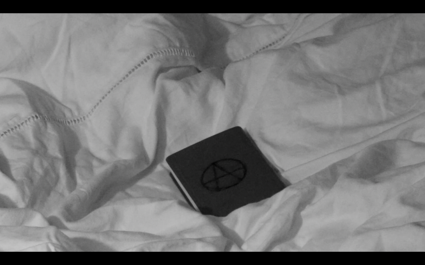
 A key text that has inspired the idea for our film is 'Kill List', the plot for this film is about the control of a cult and the toll it takes on the main characters lives. The reason for choosing this film to inspire our choices is because of the effect it had on myself when viewing this film. The discomforting feeling that I felt inspired myself to create a film with the same intentions, in the aim to get a similar reaction when viewing our thriller opening. The aim for our thriller opening is to make the audience want to keep on watching and therefore by creating an unnerving opening inspired by a dark storyline, will hopefully achieve this. There a re specific details from Kill List that we plan to use, like the cult symbol that is used within the film. I like the simplicity of the symbol and the mystery behind it. I think this symbol will be easy to re-create and will work effectively in our film.
  A film genre that have inspired our choices in our thriller, is film noir. When editing our film we are likely to change from colour to black and white with the intentions of creating the same effect that film noir creates. The reasons behind film noir is in refelection of the 'cold war' time period that it was made, ideas of mistrust, bleaknes and fear are strongly evident in the genre, to represent the dark time period in society. Even though our film is set in modern-day society, the aim of our film is to highlight the dark, dismall and frightning place the world can be and the power and control that bad people can have.
Exploring Font Types
If the wrong font is selected it can set the wrong impression for the film and set false expectations for the audience, for example if we were to decide on a bold and bulky font for our film, like the font below, it wouldn't fit with the mysterious, psychological thriller we are trying to convey in the opening. It also wouldn't correlate with the simplicity of the shots, because the majority of shots we have used are simplisticly effective so the bulkiness of this font would negatively contrast with the film.
ASCENDENCY
Another type of font we would want to avoid, is choosing anything that looks too scruffy or disordered, such as the font below. Although this font conveys a dark and msyterious tone which is the mood we want to convey, it also looks more suited to a gritty, crime thriller.
ASCENDENCY
We decided on our font by looking at simplistic looking fonts on Word, the name of this font is called ' Adobe Fan Heiti Std B' and we chose it because of the reasons it is clear to read, it's bold as well as being subtle and corresponds well with the word itself and the tone of our thriller. The placing of the spaces in between also adds to the clearness and simplicity and subtly adds more effect by making it look slightly different and interesting.
A S E N D E N C Y
This post was written by Anna Dunbar.
This post was written by Anna Dunbar.
Tuesday, 14 March 2017
Soundscape
The soundscape used in the media film will
play a vital part in setting the mood for the film; we will use a score that a
friend will have produced himself in response to our film. The score will be
used to open the film, or played throughout. Playing a score throughout the
duration will eliminate distracting background noise, which will be a difficult
element to deal with when filming outside due to the fact there are big sound
distractions such as cars, pedestrians as well as the wind and other natural
sounds. Using a score will simply eliminate the jumpiness of the sound when one
shot cuts to the next.
The motif behind the score is to create an
eerie atmosphere and to create an almost spine-chilling reaction for the
audience. The aim is to use the score in hope of it conforming to the thriller
genre and relating to what is happening on screen and to foreshadow the
darkness of the film.
Silence is also a part of the soundscape,
as we will use silence to add effect and to add to the spooky and eerie
atmosphere that we will aim to create. Silence builds tension and creates a
sense of unpredictability, leaving the audience in suspense of what is going to
happen next. It also adds more effect to particular shots, especially
simplistic shots.
Sound effects are irrelevant in the
thriller because there is no need to add emphasis that will be happening on
screen. For example if a character was being punched, you may add a punching
sound effect over the top of the audio to add emphasis and draw the audience’s
attention to what is happening on screen and to also make the sound of the
punch seem realistic for the audience.
This post was written by Anna Dunbar.
This post was written by Anna Dunbar.
Thursday, 23 February 2017
Selecting the Actors
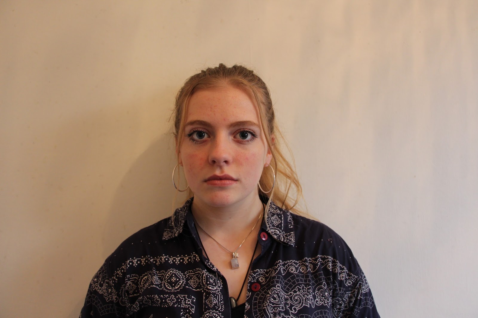
 We chose two a-level drama students for our film to achieve a higher level of realism of the characters that we wanted to portray. We chose Annie Floyd to play the more vulnerable character due to the fact she looks more innocent and therefore will provoke more of a reaction from the audience if the innocent looking character's life is in jeopardy. For our second character we chose Arthur Vaughan-Myhill who we believe could play the more sinister role of the film due to the scruffy appearance and cold emotion he could show.
This post was written by Anna Dunbar.


Explaining the Title of the Film
The title of our film is called 'Ascendancy' which was decided through brainstorming ideas around authority, power and being controlled by another group or being. Ascendancy is by definition the occupation of a position of dominant power or influence. As a group we decided on this name due to the idea of cults that it connotes, we want to give the idea of a greater being or group controlling a vulnerable person. Also the sibilance of the word creates a harsh and prominent sound when spoken out loud to foreshadow the dark story of the film. This may lead the audience to respond to the name in an unnerving yet intrigued reaction because of the mysterious and sinister connotations surrounded by the word and the sound of the pronunciation.
This post was written by Anna Dunbar.
This post was written by Anna Dunbar.
Monday, 20 February 2017
Script
Opening scene: Angelo enters the bathroom, dead girl is in a
bath, Angelo stairs into mirror – blank expression, turns to girl, lays flowers
on her and strokes her hair and leaves room.
(2 WEEKS PREVIOUS)
Second scene: Leaves house, walks down street, bumps into
women and he drops his wallet on the floor
Woman: Oh god, I’m sorry
(Both lean down to pick up wallet, woman hands wallet to
him, he stairs intensely at her)
Finn: No need to apologise…it’s completely fine
(Finn stands there watching as woman hastily walks away,
whilst there is a man in the background of the shot, carefully watching)
Third scene: Angelo is walking back from the shop, carrying
shopping bag in empty car park, he walks towards the corner of the car park and
sinks down into the corner and begins to play with the stones on the floor and
using them to make specific symbols, he then picks up a child’s toy and crushes
it in his hands, tries to pull it apart, walks back to house
Fourth scene: Angelo is sitting in his bedroom surrounded by
candles, staring at pictures of his family, when he picks up a picture he hears
voices of his family
This post was written by Anna Dunbar.
This post was written by Anna Dunbar.
Plot and Synopsis
A S E N D E N C Y
This film is about a
severely troubled boy who gradually gets influenced in daily life by a cult.
The consequences of this are relentlessly drastic.
Angelo is a young
adult, troubled by past traumatic experiences in his life which has now
impacted him for the worst. This troubled boy is deeply involved with an
unnerving cult, which leads him to being forced into horrific and
psychologically disturbing crimes. Who is the leader of this sinister cult?
Will Angelo ever escape from his traumatic thoughts and the unknown cult
group? Encountered by chilling murders
and horrifically dark tasks forced upon Angelo, is this enviably the end of his
psychological wellbeing? And what does this entail?
This post was written by Anna Dunbar.
This post was written by Anna Dunbar.
Tuesday, 10 January 2017
Thriller title sequence/ fonts
Fight Club
 In the opening title
sequence of the thriller film Fight Club, the use of fonts convey that the
actors and title sequence of the film are important and are almost forced to be
looked at due to the bold, sans serif typeface. The typeface is static however,
as the background of the title sequence is continuously moving, the typeface has been directly placed in the
center of the screen to reinforce the importance of the names; they’ve also
composed the shots so that the typography does not clash with the dynamic fluidity
of the background. The choice of a bright white colour for the typography
stands out against the dark background which reassures that the text does not
get lost in the chaotic background and helps guide the audience’s eyes to the
text that wants to be viewed. The use of the white colour for the text
contrasts with the background as well as the dark story of the film. The colour
white is commonly used to suggest purity, innocence and goodness, which highly contrast
with the storyline, which heavily focuses on violence and destruction.
In the opening title
sequence of the thriller film Fight Club, the use of fonts convey that the
actors and title sequence of the film are important and are almost forced to be
looked at due to the bold, sans serif typeface. The typeface is static however,
as the background of the title sequence is continuously moving, the typeface has been directly placed in the
center of the screen to reinforce the importance of the names; they’ve also
composed the shots so that the typography does not clash with the dynamic fluidity
of the background. The choice of a bright white colour for the typography
stands out against the dark background which reassures that the text does not
get lost in the chaotic background and helps guide the audience’s eyes to the
text that wants to be viewed. The use of the white colour for the text
contrasts with the background as well as the dark story of the film. The colour
white is commonly used to suggest purity, innocence and goodness, which highly contrast
with the storyline, which heavily focuses on violence and destruction.
The mood and atmosphere that is connoted by
the title sequence suggests disorder and mayhem, it also forebodes that the
film is going to be intense and unpredictable. This is due to the quick pace of
the moving background and the quick fading of one text to the other. The choice
of background intrigues the audience because it doesn’t become clear to what it
is and what it relates to until the sequence is over, to where you see it’s a
microscopic view of the cells and the nerves of the main character in the film.
The predominantly dark, cold tones that are used in this title sequence reflect
the films melancholic, dark story.
The Girl with the Dragon Tattoo
 The use of the serif font adds sophistication as well as being
irratic, and almost unpredictable because there doesn’t seem to be any order to
which letters are sans serif or serif. This may be used to foreshadow the plot
of the film and to set the tone. This unpredictable, careless tone is also
conveyed by the disjointed placing of the text, which is randomly positioned
around the frame of the shot.
The use of the serif font adds sophistication as well as being
irratic, and almost unpredictable because there doesn’t seem to be any order to
which letters are sans serif or serif. This may be used to foreshadow the plot
of the film and to set the tone. This unpredictable, careless tone is also
conveyed by the disjointed placing of the text, which is randomly positioned
around the frame of the shot.  The choice of using a white coloured font
is very effective as it contrasts against the bold, black moving background;
therefore making the names read clearly and reinforcing their importance. The
title of the film also has a lot of focus on it, even though the colour is no longer white but instead a grey toned which
although does not contrast against the black background, the typography is in a
bold, detailed 3D effect.
The choice of using a white coloured font
is very effective as it contrasts against the bold, black moving background;
therefore making the names read clearly and reinforcing their importance. The
title of the film also has a lot of focus on it, even though the colour is no longer white but instead a grey toned which
although does not contrast against the black background, the typography is in a
bold, detailed 3D effect.
In the opening title sequence, gothic
and horror themes are explored suggested by the heavy use of black and dark
tones. This is also conveyed by the choice of background, which shows quick
flashes of discomforting, horror-esque images. This is used in order to grab
the audience’s attention and to set the tone of the film.
Subscribe to:
Posts (Atom)